What is Cumulative Layout Shift (CLS)?

Have you ever been reading an article online when suddenly the text jumps, causing you to lose your place? Or perhaps you've gone to click a button, only to have it move at the last second, making you tap something else entirely? These frustrating experiences are caused by Cumulative Layout Shift (CLS), a critical web performance metric that can make or break your user experience.
What is Cumulative Layout Shift?
Cumulative Layout Shift is a Core Web Vital metric developed by Google that measures the visual stability of a webpage. Specifically, it quantifies how much unexpected movement of visible page content occurs during the entire lifespan of a page. CLS is expressed as a score, with lower scores indicating better performance and user experience.
Google introduced CLS as part of its Core Web Vitals initiative because visual stability directly impacts user experience. A page with poor CLS scores creates confusion, frustration, and can even lead to accidental clicks on unwanted elements—particularly problematic for e-commerce sites where users might accidentally add items to their cart or submit forms prematurely.
The CLS score is calculated by multiplying two factors: the impact fraction (how much of the viewport was affected by the shift) and the distance fraction (how far elements moved). While the technical calculation can be complex, what matters most is understanding that a CLS score of 0.1 or less is considered good, scores between 0.1 and 0.25 need improvement, and anything above 0.25 is poor.
What Causes Cumulative Layout Shift?
Understanding the root causes of CLS is essential for fixing the problem. Several common culprits contribute to layout shifts:
Images and Videos Without Dimensions
The most frequent cause of CLS is media content that loads without predefined dimensions. When a browser encounters an image or video tag without explicit width and height attributes, it initially allocates zero space for that element. Once the media loads and the browser determines its actual size, the page must reflow to accommodate it, pushing other content down or to the side.
Web Fonts Causing FOIT or FOUT
Web fonts can trigger layout shifts through two mechanisms: Flash of Invisible Text (FOIT) or Flash of Unstyled Text (FOUT). FOIT occurs when text remains invisible while custom fonts load, then suddenly appears, potentially changing the space it occupies. FOUT happens when a fallback font displays first, then switches to the custom font with different dimensions, causing content to shift. Understanding font loading strategies is crucial for preventing these issues.
Dynamically Injected Content
Content that's added to the page after initial load—such as advertisements, embeds, pop-ups, or cookie banners—can push existing content around if space isn't reserved for them. This is particularly problematic with third-party advertising networks that deliver ads of varying sizes.
Actions Requiring Network Responses
Animations or DOM changes triggered without waiting for network responses can cause shifts. For example, if clicking a button immediately changes the page layout before the server responds, and then the server response triggers additional changes, users experience jarring visual instability.
Incorrectly Sized Iframes and Embeds
Embedded content like YouTube videos, social media posts, or third-party widgets without specified dimensions will cause shifts when they load and establish their actual size requirements.
How to Measure and Check Cumulative Layout Shift
Before you can fix CLS issues, you need accurate measurements. Fortunately, multiple tools are available for checking your site's CLS performance.
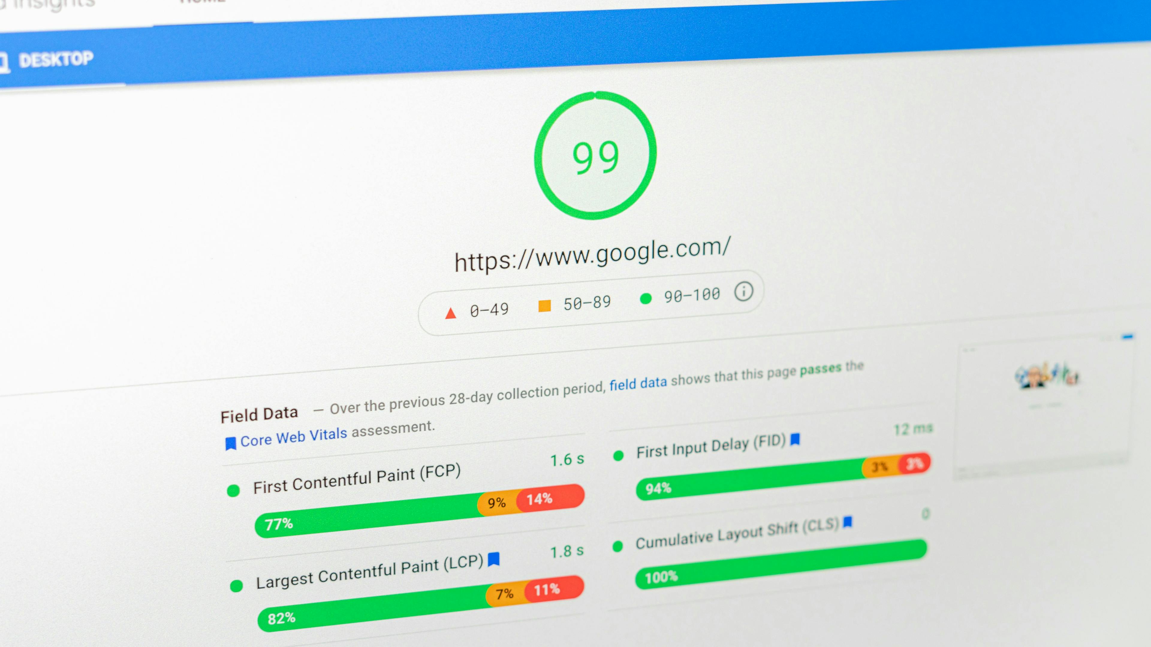
Google PageSpeed Insights is the most straightforward tool for measuring CLS. Simply enter your URL, and it provides both lab data (controlled environment testing) and field data (real user experiences from the Chrome User Experience Report). The tool also identifies specific elements causing layout shifts and provides actionable recommendations.
Chrome DevTools offers real-time CLS monitoring. Open DevTools, navigate to the Performance tab, and record a page load. The Experience section will show layout shifts as they occur, allowing you to pinpoint exactly which elements are causing problems. You can even see visual representations of shifted elements highlighted in blue.
Lighthouse, integrated into Chrome DevTools, provides comprehensive audits including CLS scoring. Run a Lighthouse audit on your page to get detailed insights into performance issues affecting your CLS score.
Web Vitals Extension is a Chrome extension that displays Core Web Vitals metrics, including CLS, as you browse. This tool is perfect for quick checks and ongoing monitoring during development.
Google Search Console shows CLS data for your entire site in the Core Web Vitals report, categorizing URLs as Good, Needs Improvement, or Poor. This bird's-eye view helps you prioritize which pages need attention first.
For the most accurate assessment, use multiple tools and check both lab and field data, as user experiences can vary based on network conditions, device types, and browser behavior.
How to Fix and Improve Cumulative Layout Shift
Once you've identified CLS issues, implementing fixes becomes your priority. Here are proven strategies for reducing and eliminating layout shifts:
Always Include Size Attributes for Images and Videos
Set explicit width and height attributes on all image and video elements. Modern browsers use these attributes to calculate aspect ratios and reserve appropriate space before media loads:
<img src="hero.jpg" width="1200" height="600" alt="Hero image">
Even if you're using responsive CSS that overrides these dimensions, the aspect ratio is preserved, preventing layout shifts.
Use CSS Aspect Ratio Boxes
For responsive designs, combine dimension attributes with CSS to maintain aspect ratios using the aspect-ratio property:
img {
  width: 100%;
  height: auto;
  aspect-ratio: attr(width) / attr(height);
}
Reserve Space for Ads and Embeds
For dynamic content like advertisements, use CSS to reserve minimum space based on the expected ad size. Use min-height properties on ad containers to prevent shifts when ads load:
.ad-container {
  min-height: 250px;
  background-color: #f0f0f0;
}
Optimize Font Loading
Implement font-display: swap or font-display: optional in your @font-face declarations to control how fonts load. The font-display: optional value prevents layout shifts by only using custom fonts if they load quickly, otherwise sticking with system fonts:
@font-face {
  font-family: 'CustomFont';
  src: url('font.woff2') format('woff2');
  font-display: optional;
}
Additionally, preload critical fonts to ensure they're available as early as possible:
<link rel="preload" href="font.woff2" as="font" type="font/woff2" crossorigin>
Position Dynamic Content Carefully
Avoid inserting new content above existing content unless it's in response to user interaction. When you must add content dynamically, use CSS transforms for animations instead of properties that trigger layout recalculation. Transforms and opacity changes don't cause layout shifts because they operate on the compositor layer.
Set Explicit Dimensions for Iframes
Always specify width and height for iframe elements. For responsive iframes like embedded videos, use the aspect ratio box technique:
<div style="position: relative; padding-bottom: 56.25%; height: 0;">
  <iframe style="position: absolute; top: 0; left: 0; width: 100%; height: 100%;" src="..."></iframe>
</div>
Avoid Inserting Content Above Existing Content
Unless responding to user interaction (like expanding an accordion), never inject content that pushes visible content downward. Position banners, notifications, and overlays using fixed or absolute positioning, or add them at the bottom of the page.
Use transform for Animations
When animating elements, use CSS transform and opacity properties rather than properties that affect layout like top, left, width, or height. Transforms are handled by the GPU and don't trigger layout recalculation:
/* Good - no layout shift */
.element {
  transform: translateY(10px);
}

/* Bad - causes layout shift */
.element {
  top: 10px;
}
How to Reduce Cumulative Layout Shift: Advanced Strategies
Beyond basic fixes, advanced optimization techniques can further improve your CLS scores:
Implement Skeleton Screens
Replace loading spinners with skeleton screens that match the dimensions and layout of content that will appear. This technique sets user expectations and prevents unexpected shifts.
Lazy Load Content Below the Fold
Use the Intersection Observer API to lazy load images and content that appears below the fold. This reduces initial page weight while preventing shifts since below-the-fold content loads as users scroll.
Optimize Third-Party Scripts
Third-party scripts often cause CLS issues. Load them asynchronously, defer non-critical scripts, and consider using facade techniques for heavy embeds like YouTube videos—show a thumbnail and only load the full embed when users interact with it.
Monitor and Test Regularly
Set up automated monitoring using tools like Lighthouse CI or WebPageTest to catch CLS regressions before they reach production. Implement performance budgets that fail builds if CLS exceeds your threshold.
Prioritize Critical CSS
Extract and inline critical CSS to ensure proper layout rendering before external stylesheets load. This prevents shifts caused by unstyled content briefly appearing with browser default styles.
Conclusion
Cumulative Layout Shift directly impacts user experience, engagement, and even conversion rates. By understanding what causes CLS, regularly measuring your scores, and implementing the fixes outlined in this guide, you can create visually stable web pages that keep users engaged and satisfied.
Start by auditing your highest-traffic pages, prioritize fixing the biggest offenders, and gradually work through your site. Remember that improving CLS is an ongoing process—new content, features, and third-party integrations can introduce new layout shifts, so continuous monitoring and optimization should become part of your development workflow.
The effort invested in reducing CLS pays dividends through improved user satisfaction, better search rankings, and higher conversion rates. Your users may not consciously notice good visual stability, but they'll certainly appreciate the smooth, predictable browsing experience it creates.


